Tiny Motions, Clear Choices

Join us as we design feedback micro-animations that gently guide user decisions without stealing focus. We’ll unpack timing, meaning, and ethical influence, share field-tested stories, and provide practical patterns you can adopt today. Read, experiment, and tell us what changes your users notice first, then share your results so we can learn together and refine what truly helps people move forward with clarity.

Principles for Noticeable Yet Calm Motion

Great interfaces whisper through motion. By pairing concise visual changes with purposeful timing, feedback can confirm intent, correct errors, and suggest next steps without noise. We’ll explore durations that feel human, curves that model physical expectations, and focus management that keeps cognition free. A short, considerate nudge often outperforms fireworks, especially when decisions carry risk or effort. Share your favorite examples and let others learn from your experiments.

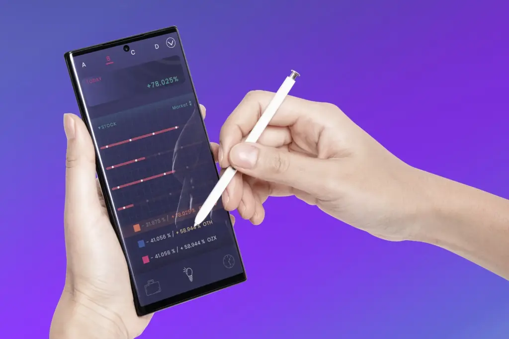
Aligning Feedback with Decision Moments

People commit when outcomes feel predictable. Tie each animation to a clear decision point: a tap, a selection, a rejection, a submit. Show immediate, contextual reactions that acknowledge input, preview consequences, and spotlight the next safe action. When timing and content of motion match intent, hesitation drops. We will outline patterns that turn uncertainty into progress and reduce costly backtracks across complex flows and challenging tasks.
A harsh shake often shames without explaining. Prefer targeted motion that points to the exact field, expands helpful guidance, and stabilizes once corrected. Combine with inline examples and forgiving validation that updates on keystroke. By transforming failure into a short, legible lesson, you protect momentum, preserve dignity, and help users decide confidently to continue rather than abandon, even when constraints or edge cases make inputs unexpectedly tricky.
Affirmation should feel earned, not flashy. A subtle checkmark morph, a pulse on the primary button, or a tidy collapse of a completed step says done while preparing attention for what is next. Avoid modal interruptions; keep flow in context. Small, respectful acknowledgments accumulate into trust, making the next decision easier and the overall journey measurably smoother, especially for tasks that repeat across sessions or devices.

Design Systems for Motion at Scale

Teams move faster when motion decisions are codified. Establish reusable tokens for duration, distance, delay, and opacity; define a semantics library that maps states to curves and intensities. Document do’s and don’ts with live examples. When designers, engineers, and writers share one motion language, interfaces feel coherent across platforms, and every decision point benefits from familiar, trustworthy feedback that evolves carefully rather than chaotically across releases.

Duration and Distance Tokens

Create named tokens such as duration.xs, duration.sm, and distance.near to normalize feel across components. Tie distances to hierarchy and intent, not device pixels. Reference these tokens in code so refactors ripple predictably. A single source of truth prevents one-off theatrics, keeping feedback subtle, consistent, and immediately legible wherever a user decides to act, regardless of platform density, animation engine, or rendering pipeline.

A Shared Easing Grammar

Define curves with memorable names - affirm, caution, dismiss, elevate - so discussions start with intent rather than bezier coordinates. Each label maps to a tested cubic-bezier tuned for clarity and comfort. Publish playgrounds where teammates compare feel side by side. Shared vocabulary compresses debate and yields repeatable decisions under pressure without sacrificing the humanity of motion or the nuance of individual product moments.

Component Contracts for Motion

Document how components announce, process, and resolve user intent. For example, a toast appears within 200 milliseconds, holds for four seconds, and exits toward its origin. Inputs gently validate as users type. Expose props or tokens for teams to tune intensity ethically. Clear contracts make guidance predictable, portable, and easier to test across releases, while preventing regressions that erode confidence during fast-paced development cycles.

A/B Tests Focused on Quality, Not Hype

Design experiments where the variant may be quieter but clearer. Evaluate decision accuracy, follow-through on subsequent steps, and help requests, not just engagement spikes. Run long enough to observe learning effects. A small, steady lift in confident completion often beats a dramatic but brittle surge that collapses later under real-world complexity, variable traffic, or seasonal behavior shifts.

Telemetry that Respects Users

Instrument events that describe exposure to motion, acceptance of guidance, and corrections made. Anonymize aggressively, aggregate thoughtfully, and honor privacy choices. Share findings in language humans understand, not dashboards alone. When analytics clarifies which micro-animations genuinely reduce confusion, teams align on fewer, better patterns that improve decisions without creeping into manipulation or coercion, preserving trust while informing future design investments.

A Field Story from Onboarding

In a mobile signup we replaced a jarring failure dialog with inline validation that expanded gently under the incorrect field, plus a micro-hint that animated an example into place. Completion rose eight percent, support tickets dropped, and - most importantly - users described feeling guided rather than judged. Small, empathetic motion reshaped a pivotal decision without adding friction or clutter.

From Idea to Implementation

Bridge design intent and code with shared prototypes, motion specs, and review rituals. Start with narrative: what should the user believe before, during, and after acting? Encode those beliefs with transforms, opacity, and state machines. Use storybook-style galleries to preview changes. Treat each release as rehearsal, tightening feedback until choices feel effortless and trustworthy across varied network conditions and device capabilities.

CSS and Web Animations API Essentials

Animate properties the GPU loves: transform and opacity. Prefer composited layers, avoid layout thrashing, and budget under 10 milliseconds per frame. Use WAAPI for sequencing and cancelation, or CSS for simplicity and reuse. Provide motion tokens as custom properties so designers and engineers iterate safely without rewriting logic during busy product cycles, reducing risk and miscommunication between functions.

Mobile Craft: iOS and Android

On iOS, Core Animation and UIKit Dynamics deliver crisp, physically credible responses; prefer implicit animations for state changes and spring damping for delight. On Android, MotionLayout and Lottie shine for complex choreography. Profile with Instruments and Android Profiler. Keep assets tiny, reuse vector paths, and ensure gestures remain responsive even under heavy network or data tasks, protecting touch confidence and perceived quality.

Performance and Battery Budgets

Every flourish costs energy. Consolidate repaints, throttle offscreen work, and pause animations when tabs hide or views background. Prefer integer pixel snapping to avoid blurs. Pre-calc paths and cache assets. Measure battery impact on mid-tier devices, not just flagships. Responsible motion feels invisible in power use, yet unmistakable in clarity when decisions matter most and reliability must shine.

Guidance without Manipulation

Motion influences choices, so wield it with humility. Favor clarity over conversion hacks, and disclose incentives where relevant. Offer ways to opt out or slow down. Seek diverse perspectives in reviews. When micro-animations align with user goals and values, they become trusted companions that illuminate paths, not tricks that push people where they never intended to go, inviting long-term loyalty.